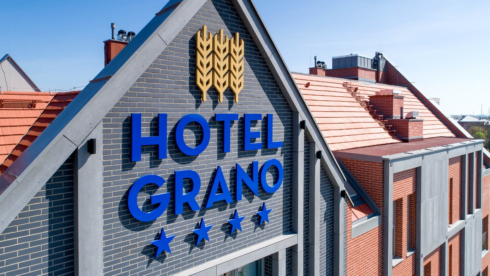
A hotel may be clearly visible as a building yet still be hard to identify from the street. Hotel façade signage should connect the property name with a specific place and the building’s architecture. A guest should be able to read the name when approaching on foot or by car, without having to search for it among windows, façade divisions, and other surrounding elements. So it’s not just the presence of a logo that matters, but how it’s translated to the scale of the building.
Exterior signage design starts with an analysis of the façade, viewing angles, and the background the lettering will sit on. Only then can you decide whether the right solution is 3D letters, an illuminated logo, a signboard, a pylon sign, or a combination of several elements.
Problem: the hotel name competes with the façade and surroundings
A hotel front is rarely an empty surface reserved solely for a logo. It is made up of windows, material breaks, canopies, balconies, installations, and decorative structures. On top of that come trees, road signs, neighbouring buildings, and other light sources.
In this environment, even a large sign may not be the first thing a viewer notices. Contrast, the sign’s proportions, its placement, and the amount of clear space around the letters all matter. Too many details nearby make it harder to recognise the name quickly.
Solution: scale and placement based on the real-world view
Signage needs to be assessed from the locations the hotel will most often be seen from. This could be the pavement on the opposite side of the street, an intersection, the approach road, a car park, or the forecourt. A photo taken straight-on to the façade doesn’t yet show how the sign will be perceived by someone in motion or viewing the building at an angle.
A larger sign is not always more legible. The lettering must keep the right proportions in relation to the façade, but it also needs clear background space. Sometimes a better result comes from moving the logo to a calmer part of the front or using a structure that creates a separate plane for it.
Mounting height also matters. A sign placed higher on the building can identify the hotel from a greater distance, while a logo above the entrance works at a closer range in direct relationship with the façade. These two elements can serve different functions and don’t need to use the same scale or fabrication technology.
Problem: a logo designed on screen must start working in real space
A logo used on a website, business card, or printed material is a flat mark, usually viewed against a uniform background. On a façade it gains thickness, returns, mounting details, and a relationship with the building material. Each of these choices affects how the mark is perceived.
Thin strokes, tight spacing, and small details may look good in a graphic file, but once transferred to the façade they require separate analysis. You need to check how they behave when scaled up and whether they remain readable from the intended distance. The relationship between the main name, descriptor line, and brand symbol is also important.
Solution: 3D letters matched to the façade material and rhythm
Dimensional letters separate the logo from the building surface through their own depth, returns, and mounting method. They can feature face illumination, halo illumination directed onto the façade, or a non-illuminated finish. The choice affects how the sign looks by day, after dark, and how it relates to the material behind the letters.
Front illumination draws attention to the face and helps keep the hotel name’s shape crisp on a darker background. A halo effect uses the façade as a light-reflecting surface, so it requires the right colour, texture, and spacing between the letters and the wall. Non-illuminated letters can work through colour, metallic finishes, and ambient light.
At voco Katowice, face-lit 3D letters were installed above the entrance on a metal mesh structure. The white face clearly separates the name from the gold background, while the dark returns reveal the dimensional construction of the characters. The structure creates a dedicated plane for the logo without covering the distinctive surface behind the letters.
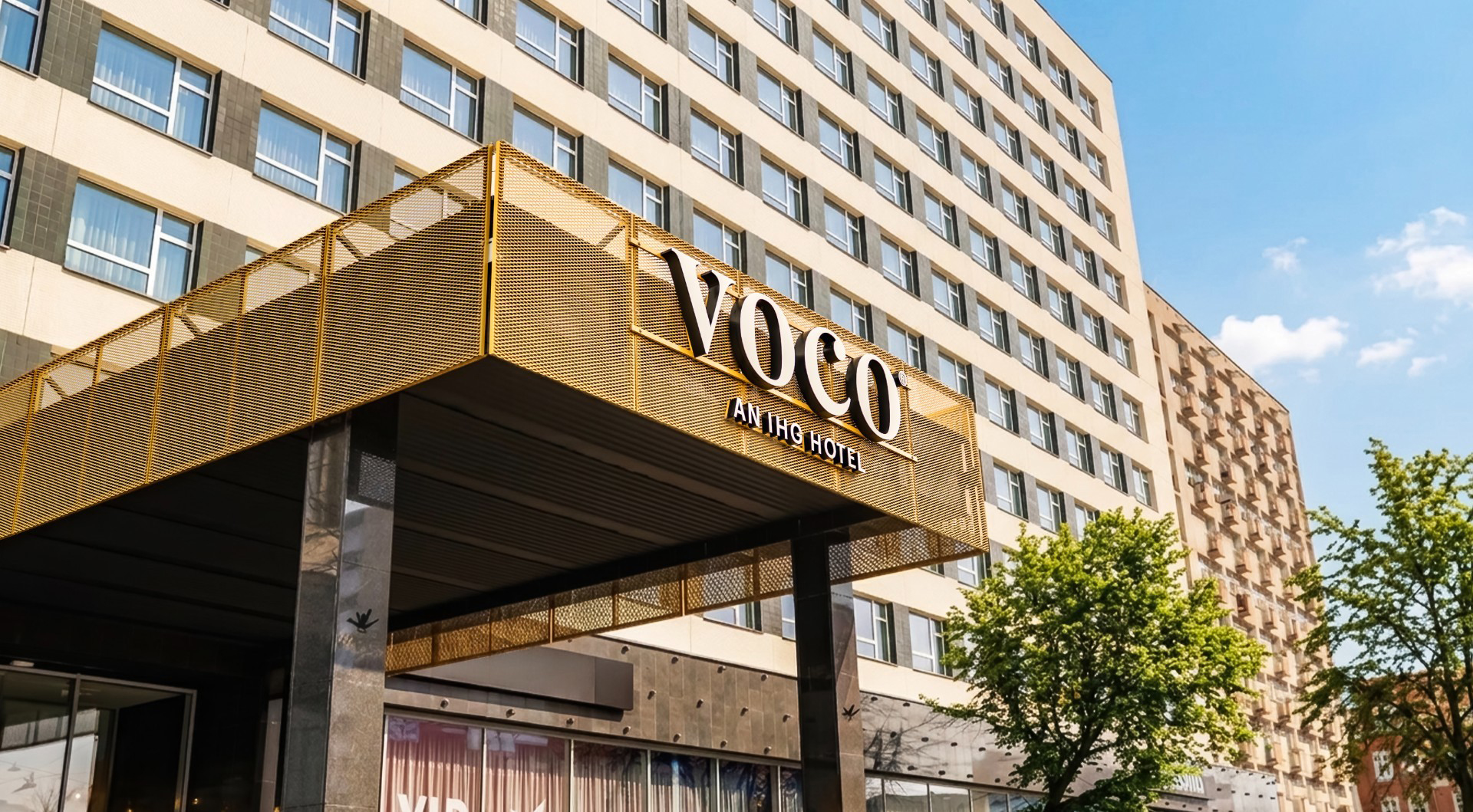
The brightness of the sign should be assessed in relation to its surroundings, not as a standalone parameter. A calm façade on a poorly lit street calls for a different approach than a front surrounded by shopfronts and multiple light sources. Legibility comes from contrast and retaining the letterforms, not from maximum brightness.
Façade signage is responsible for identifying the hotel from the outside. After you pass through the entrance, the informational role is taken over by the building wayfinding system, which guides the user to reception, the lift, the room, and other parts of the property.
Custom hotel façade signage
Before choosing the type of letters, it’s worth defining from what distance the name should be recognisable, what background it will be on, and whether it will be viewed mainly by pedestrians or also from the road. You should also verify the façade’s mounting options, where power can be routed, and the access required during installation.
To prepare a design, you’ll need the logo in a vector file, photos of the entire façade, approximate dimensions of the mounting area, and photos taken from the main viewing directions. Based on this, PRETENDE can determine the lettering proportions, fabrication method, illumination type, and the sign’s placement in relation to the architecture.
Hotel signage should look like part of the façade, not something added after the building design is complete. The goal of the design is to translate the logo into 3D letters or a signboard so the name retains the brand character and remains readable in the real environment.
Frequently asked questions
1. What signage can be installed on a hotel façade?
Façades commonly use, among other solutions, 3D letters, illuminated logotypes, signboards, and lettering mounted on additional structures. The choice depends on the architecture, mounting location, and viewing distance.
2. How do you choose the letter size for a hotel façade?
Letter size should be evaluated in relation to distance, viewing angle, façade proportions, and the environment around the sign. It’s best to verify the design on a visualisation showing the entire building, not just a fragment of the front.
3. Should 3D letters on a hotel be illuminated?
Illumination is justified if the name needs to remain visible after dark. The type should be selected with the logo colour palette, façade material, and ambient light level in mind.
4. What’s the difference between face illumination and a halo effect?
With face illumination, light passes through the letter face. With a halo effect, light is directed backwards and reflected off the façade, creating a bright outline around the sign.
5. Can a hotel logo be mounted on an additional structure?
Yes, if required by the façade construction or the intended visual result. A structure can create a clear background for the letters and organise their placement in relation to façade divisions.
6. What is needed to prepare a design?
You’ll need the logo in a vector file, photos of the building, approximate dimensions of the mounting area, and photos from the directions the hotel will most often be viewed from. Information about the façade, power supply, and installation access is also important.