Large event letters can become one of the strongest features of the entire space—spelling out the event name, showcasing the brand logo, creating a photo moment, or becoming the element attendees remember and share. Under one condition: they must be designed as part of the event, not simply as an enlarged logo.
With a large format, every mistake becomes more visible. Wrong proportions, incorrect letter depth, a random base, or issues bringing the structure into the venue can determine the outcome of the whole installation. That’s why for event projects we don’t analyse only how the lettering looks. The space, viewing distance, stability, transport, installation, and what will happen to the letters after the event also matter.
Size starts with the space, not the letter dimensions
The question “how big should the letters be?” should come only after: “exactly where will they stand?”. A different scale is needed for lettering placed by a large outdoor stage, a different one for a logo in a photo zone, and yet another for branding at the conference entrance. In a large hall, lettering that’s too small can disappear among screens, lighting, staging, and exhibition stand builds. In a smaller space, overly wide or deep letters can take up space needed for attendees and disrupt circulation.
Viewing distance also matters. By a stage, what counts most is scale, a clean outline, contrast, and readability in a wide shot. In a photo zone, you can allow more detail because attendees are much closer to the structure.
For outdoor installations, additional variables come into play:
- the type and evenness of the ground,
- the option to anchor or ballast,
- wind exposure,
- access for the installation crew,
- how the structure will be secured.
That’s why one of the most useful images at the start of a project isn’t a Pinterest inspiration—it’s a photo of the exact spot where the lettering is meant to stand. It helps assess the surrounding scale, the available area, and the relationship between the letters and the other event elements.
Not every large letter needs to do the same job
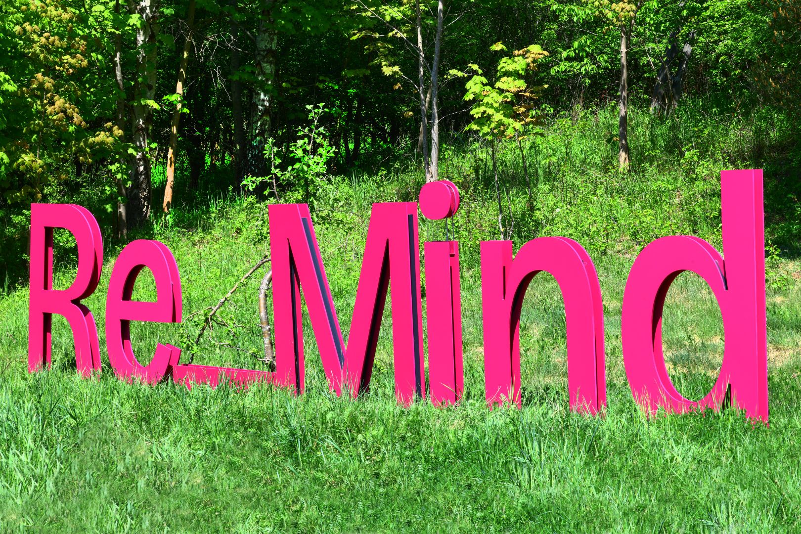
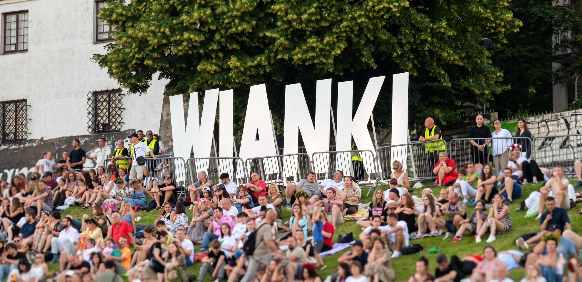
A large-format sign can serve several very different purposes. It can be a landmark. It can frame the stage set. It can create a brand zone. It can be a photo feature. It can also become a standalone spatial object that part of the event happens around. That changes the design approach. In the WIANKI project, flat, single-sided letters were tailored to the open riverside event space on the Vistula. In this case, scale was the most important factor—the sign had to stay visible above the crowd and remain legible from a distance. RE_MIND works completely differently. The intense colour and 3D form separate the sign from the surrounding greenery. The letters aren’t just an event label. They create a distinct point in the space.
Conference stage lettering has yet another set of requirements. It must read in wide shots and in photography, but it can’t compete with the screen, block speakers, or limit the stage design. That’s why, before defining the letter size, it’s worth agreeing on the exact function they should serve.
When you scale up the logo, does it still look like your brand?
Large format mercilessly exposes differences in proportions. That’s why taking a logo from a screen to an object one, two, or even several metres tall is not just about scaling it up.
What matters includes:
- character proportions,
- typeface and stroke weight,
- outline,
- 3D depth,
- how individual elements are positioned,
- the relationship between the face and the returns/sides,
- how a flat mark is translated into a 3D form.
Thin parts of a logo may require additional support. An irregular mark may need different ground contact points. In some cases, the full logo, once scaled up, will look worse than just the logotype or a distinctive brand element.
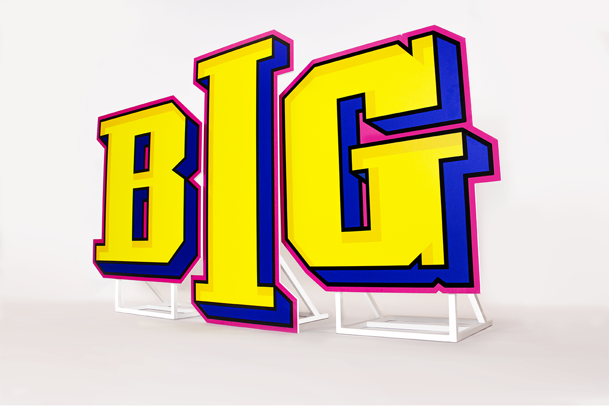
A good example is the BIG project. The yellow faces, blue sides, black outlines, and pink border aren’t a random colour mix. The entire geometry comes from the brand’s visual identity. That’s why the brand book, vector files, and logo usage rules are design inputs for us—not something sent at the end.
A big letter doesn’t have to be a heavy letter
For event work, you also need to think about what won’t be visible in the final photo. The letters must be manufactured, packed, loaded, transported, unloaded, carried into the venue, positioned, and often dismantled again a few hours later. The weight of the structure therefore has a direct impact on the entire event logistics.
Large format can remain relatively lightweight, but it requires the right engineering: the technology, stiffeners, and internal framework. You also need to answer very practical questions:
- Will it fit in the vehicle?
- Will it fit through the doors?
- Will it fit in the lift?
- Will it fit through technical corridors?
- Can it be manoeuvred between a finished build?
For very large installations, it can be better to divide the structure into segments and design joints that will be practically invisible once assembled. It’s far easier to solve this at the design stage than during unloading a few hours before the event starts.
The most important structural element is often almost invisible
A freestanding letter should, above all, remain freestanding. It sounds obvious, but as height increases, the centre of gravity, structural loads, and base requirements change completely.
The stabilisation method depends, among other things, on:
- the height and depth of the element,
- the geometry of the mark,
- the centre of gravity,
- the type of ground surface,
- attendee access,
- the application location—indoors or outdoors.
A decoration behind a stage, where attendees have no access, is designed differently than two-metre letters in the middle of a public photo zone. Outdoors, weather conditions and wind exposure also come into play.
That’s why the base shouldn’t be something “added” at the end of the project. It can be integrated into the structure, visually concealed, or intentionally incorporated into the set design. The best stabilisation is the kind attendees barely notice—but the designer planned from the start.
Material choice depends on what will happen to the letters afterwards
Two projects can look almost identical in a rendering and still be made using completely different fabrication methods. Why? Because an element needed for a few hours inside a hall is designed differently than a structure that will be transported between events for several seasons.
When choosing the fabrication method, we analyse, among other things:
- surface durability,
- areas most exposed to impact,
- component weight,
- how the elements will be carried/handled,
- stability,
- installation frequency,
- transport and storage conditions.
That’s why the material decision shouldn’t be the first decision in the project. First you need to know where the structure will be used, for how long, how often, and in what way. Only then can you consciously select the right technology.
One sign. More than one event.
If a brand regularly attends trade shows, conferences, product launches, or promotional events, it’s worth viewing large letters not as a one-off decoration but as part of your own event system. That changes the design approach from day one.
What matters then:
- fast installation and dismantling,
- a sensible number of separate parts,
- ease of transport,
- surface durability,
- packing method,
- the ability to store safely,
- the ability to reuse bases and structural components.
In the BIG project, the platform was prepared with reuse in mind. An element that forms part of the set on the first event can also work on subsequent brand activations.
If you already know the sign will be used multiple times, it’s worth saying so before the project starts. A structure for one evening and a structure for a dozen events shouldn’t be designed the same way.
Event coming up soon? The most time can be lost at the start
A short deadline in the event industry isn’t the exception. Event concepts change, as do partners, set design, stage layout, and the asset list. That’s why the production of large letters often starts when there’s already relatively little time left before the event.
In that situation, the biggest constraint isn’t always the production itself. Often, it’s the lack of decisions.
To quickly assess feasibility, we primarily need:
- the logo or sign content in a vector file,
- an approximate size,
- the exact event date,
- information: indoor or outdoor,
- a photo of the installation location,
- transport and installation details.
For very large sizes, door, lift, corridor, and technical access dimensions may also be needed. The approval process also matters. Changing the height, construction, colour scheme, or placement after production has started may require returning to earlier stages.
That’s why, on short-deadline projects, the best setup is a single decision-maker on the organiser’s side—someone who gathers information and approves the design efficiently. Limited time doesn’t have to mean compromising the outcome. It does, however, require fast and well-structured decisions.
The result you see at the event is created much earlier
In the end, attendees only see the letters. They don’t see the spatial analysis, internal structure, support points, segmentation strategy, surface protection, or transport decisions. And that’s exactly the point.
A well-designed object should look natural within the event space, even though many technical decisions stand behind its simple form.
If you’re preparing an event and need a large sign, logo, or freestanding letters, send us four things:
- the event date,
- the logo file or sign text,
- an approximate size,
- a photo of the spot where the installation is to stand.
Based on that, we can assess the project scale and production options, and propose a solution tailored not only to the look, but also to the space, transport, installation, and timeline.
Frequently asked questions
1. Where can large event letters be placed?
By the stage, at the entrance, at a stand, in a photo zone, or as a standalone feature within the brand space. The location affects the letter size, stabilisation method, construction, and finish.
2. What information is needed to prepare the design?
The most important are: the logo file or sign text, the event date, an approximate size, and photos of the location. It’s also worth defining from the start whether the installation will be used indoors or outdoors, and whether it will be used at future events.
3. Do large event letters have to be heavy?
No. Large format doesn’t automatically mean high weight. The construction and fabrication method can be designed to reduce weight while maintaining the parameters required for the specific application.
4. Can the letters be used at multiple events?
Yes. If this is known before the project starts, the construction, joints, bases, surface protection, packing, and the transport and storage method can be planned accordingly.
5. Can large letters be used outdoors?
Yes, if the structure has been designed for outdoor use. The ground surface, weather conditions, wind exposure, duration of use, and stabilisation method must be taken into account.
6. Can large letters be produced on a short deadline?
This is assessed individually. The key factors are size, geometry, fabrication method, and the event date. The process can be significantly accelerated by sending complete files, dimensions, location photos, and transport and installation details from the outset.