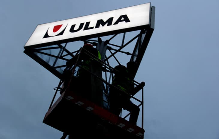
What is a roadside pylon sign
Role in long-distance identification
A SIGN THAT WORKS BEFORE THE VISITOR REACHES THE SITE
A road pylon is designed for situations where a brand, site or zone needs to be recognised from a greater distance. It can be used by a road, at an entrance, in a car park, shopping centre, business park, hotel, service station, showroom or multi-tenant property.
Its purpose is not simply to provide height. A well-designed, tall freestanding totem helps orient visitors, makes the location easier to recognise and reassures them that they are approaching the right site.
Visibility before the decision
READABLE FROM THE ROAD, NOT JUST AT THE ENTRANCE
A roadside totem should be visible before a driver passes the entrance, turn, car park or decision point. If the sign appears too late, drivers may react hastily, turn back or look for additional signs.
That is why, with location pylons, it is not only the height of the structure that matters, but also the viewing angle, traffic speed, distance from the road, logo legibility, contrast and how it relates to its surroundings.
When does it make sense?
WHEN A SITE NEEDS TO BE IDENTIFIED FROM A GREATER DISTANCE
A tall freestanding sign is worth considering when the building itself is not visible enough from the approach route, the entrance needs to be identified in advance, or the site is located on a busy road.
This solution works well for retail parks, service facilities, hotels, showrooms, stations, logistics centres, clinics, office buildings, campuses and multi-tenant complexes.
Materials and technologies
BUILT FOR LARGE-SCALE, LONG-TERM EXPOSURE
Roadside pylons, tall freestanding totems, information towers and roadside signs can be made using steel structures, aluminium, technical composites, painted panels, illuminated cabinets, three-dimensional letters, information modules and backlit graphic panels.
The choice of technology depends on the sign’s height, viewing distance, location, wind exposure, type of illumination, amount of information, servicing method and the desired visual standard of the installation.
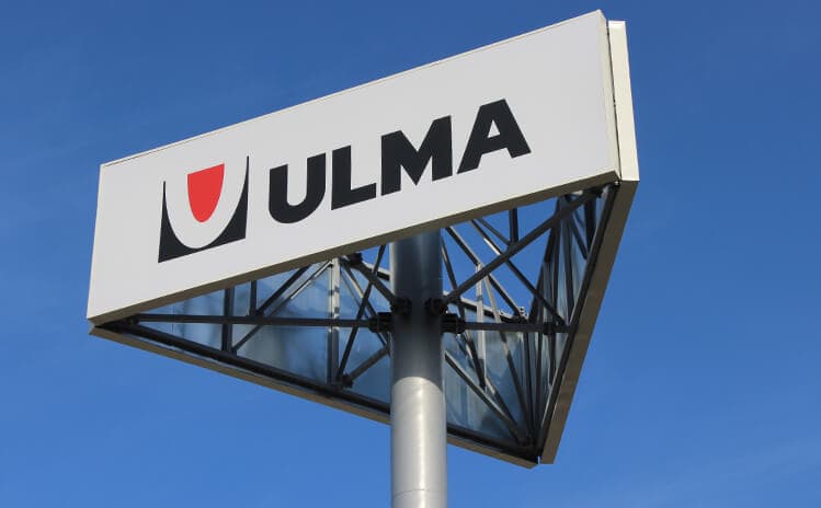
Scale and Location
Position relative to the road and entrance
A SIGN AS A LANDMARK
A roadside pylon should be designed around the layout of the site: the road, entrance, car park, driveway, sightlines, greenery, buildings and the way people move around. It should not simply be a tall structure placed wherever there happens to be space.
A well-positioned information tower serves as a landmark. It helps people identify the site more quickly, makes access easier to navigate and creates the first point of contact with the brand before visitors even enter the premises.
Height and proportion
SCALE BASED ON VIEWING DISTANCE
The height of a roadside pylon should be determined by the actual viewing distance, traffic speed and surroundings. A sign beside a local access road calls for a different scale than a tall identification tower alongside a busy route.
A pylon that is too low may disappear into the landscape, while one that is too tall may feel out of proportion with the building. That is why the proportions of the structure, logo height, width of the information panel and the way the structure is set into the terrain are all important.
Visibility in the surroundings
A SIGN THAT STANDS OUT IN THE LANDSCAPE
A roadside sign must work in its real surroundings: among trees, traffic, building façades, other signs, lighting, poles and parking areas, and in changing weather conditions.
That is why designing a large-format freestanding sign calls for an analysis of the background, contrast, material, lighting and legibility at different times of day. Good visibility does not come from simply making the structure bigger.
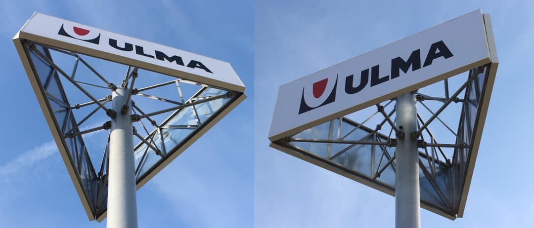
Clear Message from a Long Distance
Information on the sign
BRAND, LOCATION AND THE MOST IMPORTANT MESSAGE
A roadside pylon should usually display elements that can be read quickly: a logo, the name of the site, the name of the main tenant, a symbol indicating its function, the entrance direction or basic location information.
This is not the place for a detailed description of services, a detailed site map or an excess of small text. A tall roadside totem works best when people can recognise the brand and location without having to read for long.
Logo and information hierarchy
RECOGNITION FIRST, DETAILS SECOND
For roadside pylons, information hierarchy matters more than the number of messages. The user should see the brand or venue name first, followed by additional information.
Typography, letter size, contrast, logo proportions and panel layout must be designed for traffic and viewing distance. What looks good in a design may be unreadable from the road if it does not account for how people actually view it.
Multi-tenant properties
MULTIPLE BRANDS, ONE STANDARD
Tall freestanding totems are often used at multi-tenant properties such as retail parks, service centres, office buildings, stations, hotels and commercial complexes. In these locations, it is important to organise multiple names within a single structure.
An information tower with a tenant directory should remain legible from a distance and maintain a consistent visual standard. Too many logos, uneven panels, arbitrary colours and a lack of hierarchy can quickly turn the sign into a chaotic column of information.

Effectiveness of a Road Sign
Read on the move
JUST SECONDS TO RECOGNISE THE LOCATION
A roadside pylon often has only a brief window to make an impression. Drivers see the sign for just a few seconds, so the message needs to be simple, high-contrast and easy to read at a glance.
Effectiveness depends on the viewing distance, traffic speed, letter size, logo visibility, background, lighting and whether the sign appears at the right moment before a turn or entrance decision.
Illumination and night operation
VISIBILITY AFTER DARK, WITHOUT UNINTENDED EFFECTS
A roadside totem can be illuminated in its entirety, partially, or only in its most important elements: the logo, the site name, tenant panels, the edge of the structure, or the information module.
Lighting should enhance recognition and legibility from a distance, but must not distort the sign’s proportions or create visual clutter. For tall structures, even illumination, ease of maintenance, and quality performance after dark are important.
Structure and foundation
TALL SIGNAGE REQUIRES RESPONSIBLE DESIGN
Information towers, location pylons and large-format freestanding signs are substantial outdoor structures, so they require appropriate technical design and foundations, resistance to weather conditions, and carefully planned maintenance access.
Durability depends on the supporting structure, choice of materials, installation method, wind exposure, illumination, quality of detailing and the ability to carry out maintenance safely over the years of use.
Most common mistakes
MISTAKES THAT WEAKEN A SITE’S VISIBILITY AND STANDING
The most common mistakes when designing roadside pylons, roadside totems and identification towers stem from focusing solely on height. A large sign will not be effective if it contains too much information, uses poor typography, has a haphazard hierarchy, is poorly positioned in relation to the road or lacks sufficient contrast.
Other problems include a lack of connection to the site’s architecture, harsh lighting, difficult maintenance and a structure unsuited to outdoor conditions. A sign visible from the road should help people find their way and convey the importance of the place, rather than simply dominate its surroundings.


FAQ
1) Do “roadside pylon”, “roadside totem” and “information tower” mean the same thing?
Roadside pylon, roadside totem, information tower and large-format freestanding sign are terms used for similar signage systems visible from the road or from a long distance.
The differences mainly come down to scale, function, structure and how they are positioned in relation to the access road, entrance and the site/building.2) When does a roadside pylon sign make more sense than a lower entrance pylon?
A roadside pylon sign makes sense when the site needs to be recognized earlier — from the road, a parking lot, an access route, or from a long distance.
A lower entrance pylon works closer to the building, while a tall freestanding totem sign helps users spot the location before they reach the entrance area itself.3) Does a tall freestanding sign have to include a lot of information?
No. The greater the viewing distance, the more selective the message should be. On a roadside pylon sign, the key information works best: the brand, the site/facility name, the anchor tenant, the entry direction, or a basic location cue.
4) Can an information totem display multiple tenants?
Yes, but it requires a very well-designed hierarchy. With multiple tenants, the proportions of the panels, the order of names, limiting the amount of content, and a consistent visual standard are crucial. Without that, a tall sign quickly turns into an illegible column of information.
5) Should a roadside totem sign be illuminated?
Backlighting makes sense when the sign needs to work after dark—by a road, in a car park, at a hotel, a retail park, a station, or any location with evening footfall.
The light should improve recognition from a distance, but it must not compromise legibility or the sign’s proportions.6) What has the biggest impact on the effectiveness of a wayfinding pylon sign?
The key factors are location, mounting height, reading distance, traffic speed, contrast, type size, logo exposure, and the moment when the user first sees the sign. Size alone doesn’t guarantee effectiveness.
7) What most affects the cost of a tall roadside totem sign?
Cost is influenced by the structure height, technical design, materials, foundation, illumination, number of information panels, installation conditions, service access, and the level of customization.
A tall roadside pylon requires a different scope of preparation than a lower sign at the entrance.