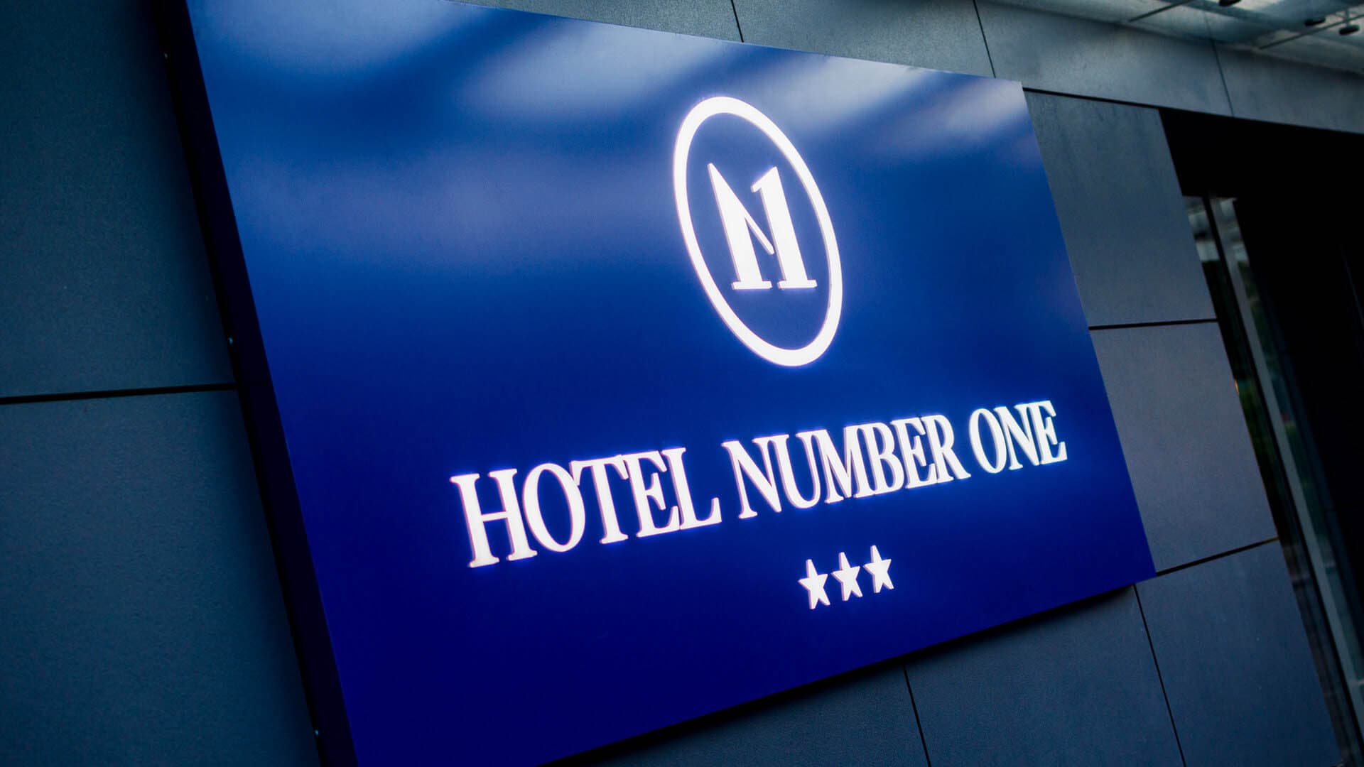
An illuminated sign box and three-dimensional letters can display the same logo, but they create its presence on a façade in different ways. A sign box gives the brand its own surface of colour and light. Letters use the building wall as a visible part of the composition. Neither technology is inherently better. The client does not need to choose a solution before the project begins. First, it is worth assessing the façade, logo, viewing direction, amount of information and lighting conditions. Only then can you determine which form will suit the location, or whether it is worth combining features of both technologies.
Two different ways to present the same brand
A sign box is an enclosed structure with its own frame, face and purpose-designed illumination. This allows the designer to control the background, contrast, proportions and placement of every element. The façade remains the setting for the sign, but it does not directly affect the legibility of each character. Three-dimensional letters work differently. Individual letters and logo elements are mounted separately, leaving the façade material visible between them. The wall colour, texture, divisions and lighting therefore become part of the overall composition. The difference is not merely aesthetic. It affects visibility, installation, power routing, the extent of illumination and future access for maintenance.
When a sign box’s own surface supports the design
An illuminated sign box provides a controlled background for the brand. It can use a corporate colour, an even field of light or a composition that combines the logo with a short description of the business. It works well when the signage needs to read as a clear, self-contained whole. This is a deliberate design choice, not a fallback. A sign box can be a subtle feature of the façade, a striking illuminated focal point or a precisely crafted form tailored to the architecture. Its appearance is determined by its proportions, face material, construction depth, edge details and how it is mounted on the building. Sign boxes do not have to have a flat face. Depending on the design, they can use acrylic, a flexible illuminated surface, a metal face with cut-out elements or a three-dimensionally formed logo.
When the façade should remain part of the signage
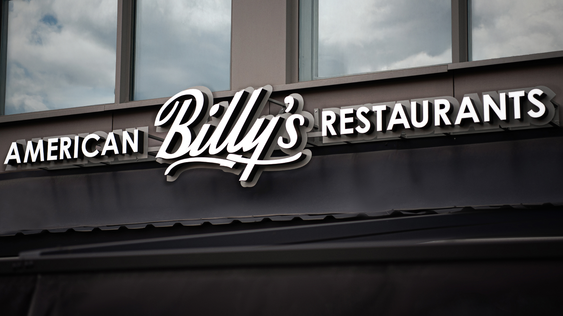
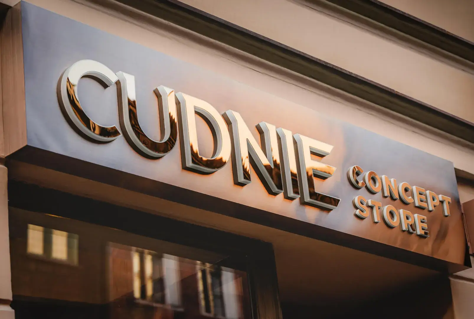
Three-dimensional letters let the building material remain visible. Stone, brick, metal panels, wood or understated render can provide a natural backdrop for the logo. The sign does not occupy one solid surface; instead, it fits into the façade’s divisions and proportions. This approach requires the contrast to be checked. The letters should remain legible against the façade both during the day and after dark. Other important factors include the stroke thickness in the logo, spacing between characters, the length of the name and the distance from which the signage will be viewed. Letters can be unlit, illuminated from the front or sides, or create a halo on the wall. Each approach changes the relationship between the sign and the architecture.
Sign boxes and letters do not always have to be mutually exclusive
Some designs combine features of both technologies. A sign box can incorporate three-dimensional letters, routed details or a moulded 3D face. This gives the brand its own surface of colour and light while adding depth to the logo. This combination works well when flat graphics do not achieve the desired effect, but letters alone are also not suited to the façade. A combined solution should not be chosen merely to add more effects. Every additional element affects the structure, depth, installation and future maintenance. The technology should support legibility and the brand’s character, not complicate the sign without a clear reason.
Legibility by day and after dark
A sign box can create an even field of light or illuminate selected parts of the logo. The effect depends on the type of face, construction depth, placement of the LED modules and how the light is diffused. With letters, the light works within the individual characters or on the wall behind them. Legibility depends on scale, stroke width, spacing and the chosen lighting method. Very small logo elements may need technical adaptation to preserve the logo’s character and ensure the light sources can be made correctly. Both solutions can be clearly visible from a long distance. The result is not determined by the technology alone, but by the design as a whole: sign size, contrast, ambient brightness, mounting height and the direction from which the viewer approaches.
A brand’s character is shaped by the details
A lightbox does not automatically mean basic signage, and letters do not guarantee an impressive result. In both cases, the design, materials, proportions, surface, colour, lighting and quality of finish determine how the sign is perceived. A brand that relies on a bold field of colour can communicate effectively with a solid lightbox surface. An identity based on typography and materials can work naturally as individual letters. Another design may call for a lightbox with a three-dimensional logo. That is why a brand’s character should be considered alongside the architecture. Once installed, the sign sits alongside the windows, façade divisions, lighting, shopfront and other elements of the building.
Installation and maintenance are part of the decision
A lightbox brings the structure, lighting and power supply together in a single unit. The design should account for the mounting method, cable routing and access to the interior. For larger formats, the structural sections, transport and the ability to replace lighting elements also matter. Each letter may have its own mounting and electrical connection. The installation must be planned so that the cables do not detract from the appearance of the façade. In some locations, a shared backing panel or support structure is used, but its form also affects how the logo is perceived. Neither solution is automatically easier to install or maintain. Much depends on the height, façade type, sign dimensions, technical access and how the power supply is prepared.
How to decide without guessing
Clients do not need to choose the technology themselves. A logo, photos of the façade, approximate dimensions and information about the desired effect are enough for an initial assessment. On this basis, different options can be compared and assessed for how well each would work with the building. The choice should take into account the façade’s appearance and construction, the logo’s shape, the amount of information, viewing distance, visibility after dark, access to power and future maintenance. In some cases, a lightbox will be the right choice; in others, three-dimensional letters—or, for some projects, a system combining both technologies.
PRETENDE lightboxes and three-dimensional letters
PRETENDE designs and manufactures lightboxes and illuminated signs, as well as three-dimensional letters and 3D logos. We treat both options as fully fledged signage systems. We select the technology to suit the location, logo, viewing conditions and desired effect.
To prepare a proposal, we need: the logo in vector format, photos of the façade taken straight on and from the direction of approach, approximate dimensions of the available area, information about the substrate, access to power and the planned installation date. You can send the materials via the signage project enquiry form. You do not need to decide in advance whether your enquiry is about a lightbox or letters.
Lightboxes and three-dimensional letters address different design needs, but neither technology is inherently better. A lightbox gives a brand its own surface of light and colour, while letters make the façade part of the composition. The right choice depends on the logo, architecture, viewing conditions and desired effect.
Frequently asked questions
1. Which is more visible: a lightbox or three-dimensional letters?
Both options can provide good visibility. The result depends on size, contrast, illumination, the façade and viewing distance.
2. Do three-dimensional letters always look more prestigious?
No. The design, materials, proportions, lighting and quality of workmanship determine how signage is perceived—not the name of the technology alone.
3. Does a lightbox have to have a flat face?
No. A lightbox can feature a front panel with cut-out elements, three-dimensional letters or a moulded 3D face tailored to the logo.
4. Can a lightbox be combined with three-dimensional letters?
Yes. This combines a controlled background and illuminated surface with the three-dimensional character of a logo.
5. Can both types of sign be illuminated?
Yes. A lightbox can illuminate its entire face or selected elements. Letters can be front-lit, halo-lit or designed to cast a glow onto the façade.
6. Do I need to choose a technology before sending an enquiry?
No. A logo, photos of the façade and basic dimensions are enough to compare the available options and identify the right approach.